Top 5 Tips to Create a Memorable Photographer 'About Me' Page

Do you think your 'About Me' page is just a bio? Think again! A well-written 'About Me' page can do more for your business than any other self-promotion material. It shows who you are, what you value, and how you work, all these insights can't be reflected in a portfolio alone. When done right, it can differentiate your business from the sea of photographers online, making potential clients choose you over others!
You might be wondering why this page is so important. The reasons are simple. It humanises your brand, letting clients feel like they know you before meeting you. Photography sessions are inherently intimate experiences. Capturing genuine moments and natural expressions requires a level of comfort and trust between the photographer and the client. That's why 'About Me' does more than introduce you; it helps potential clients get a sense of who you are and whether they’ll feel comfortable working with you.
However, we understand that finding the right words to talk about yourself and shaping those words into a professional and engaging introduction is challenging. That's why we've compiled key tips to help you craft an 'About Me' page that not only introduces you but also impresses your audience. Let’s get into it, here are our top 5 tips for a great photographer 'About Me' page.
Make It Front and Centre
Your 'About Me' page should be easily accessible, whether through social media highlights or your website menu. Ensure visitors can find it in a maximum of one click, making it simple for potential clients to learn about you without navigating through multiple pages.
Make sure this page includes who you are, and where you are based. It's critical to provide clients with the most relevant information immediately away. Plus, it is also significant for SEO. Clearly stating your geographic area and the type of photography you specialise in, increases the chances of your website appearing in relevant search results. This means more web traffic, potential clients, and ultimately, more business!
When you explicitly describe your services, you help potential clients quickly determine if you are the right fit for their needs right away. Use descriptive language and include a few examples. This helps potential clients understand what they can expect from your work and see if it aligns with their vision.
Formatting Your Introduction
Some people favour two-sentence introductions, while others prefer them to be an unending scroll of personal information. Ideally, your 'About Me' section should be brief enough to keep people's interest so they can read it all, but not so short that they don't get a feel of who you are.
Aim for around 300 to 500 words. This length is usually sufficient to cover your key points without overwhelming the reader. It’s also recommended to use short paragraphs, bullet points, and headings to break up the text. This makes it easier for readers to skim and find the information they're interested in.

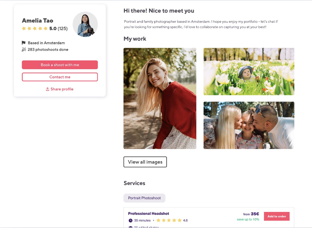
At Smiler, we know that your bio is the first step in building a relationship with potential clients. That's why on Storefronts, your 'About Me' section is displayed at the top of the page, ensuring that clients get a sense of who you are before they start exploring your work - allowing clients to quickly understand who you are. This immediate connection can make them feel more comfortable and inclined to engage with your work further.
Balance Personal with Professional
Your About Me page is your chance to let your personality shine. Use language that reflects your personality and helps clients get a sense of your character. Many photographers list their credentials and experience, but what really resonates with clients is your story. However, while it’s important to connect on a personal level, don’t forget to emphasise your expertise and reliability while doing so.
Make sure there's a picture of you somewhere on your site, preferably in an easy-to-find location. Putting a face to the name is crucial since it makes you more approachable and relatable. This visual introduction can make clients more comfortable and confident in choosing you as their photographer.

Your name prominently displayed alongside your photo makes your brand more relatable. Clients are more likely to remember a person than a business name alone. Listing where you’re based is crucial for attracting local clients as well. Many people prefer to hire photographers from their area due to convenience and familiarity. By clearly stating your location, you can attract clients who are specifically looking for local photographers.
Capitalise on Testimonials & Reviews
One of the most powerful psychological triggers in consumer behaviour is the concept of social proof. This principle, introduced by psychologist Robert Cialdini, suggests that people look to others’ actions and opinions to determine their own. When potential clients see that others have had positive experiences with your photography services, they’re more likely to trust and choose you.
When potential clients see genuine feedback from satisfied customers, it diminishes their fears and uncertainties, making them more comfortable and confident in their decision to hire you.
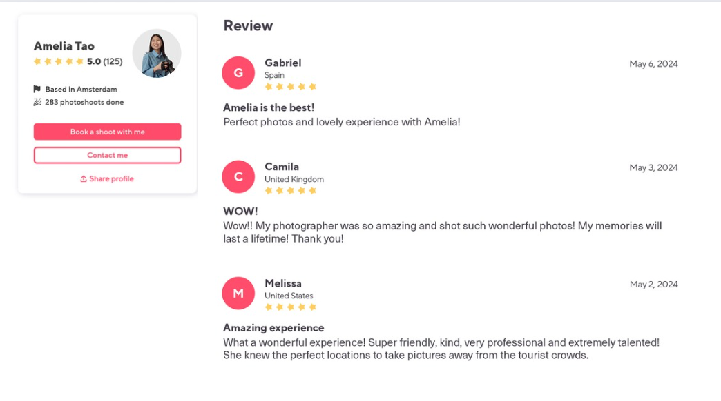
Reviews often highlight aspects of your service that you might not have considered emphasising. For instance, clients might praise your punctuality, friendliness, creativity, or the way you made them feel comfortable during the shoot. These unique selling points carry much more weight when they are mentioned by clients.

Traditionally, gathering client testimonials often involves reaching out to clients after their shoot, patiently waiting for their responses, and then curating their feedback to highlight on your website or social media platforms. Though time-consuming, skipping out on collecting and showcasing testimonials isn’t just a small oversight—it can significantly impact your business.
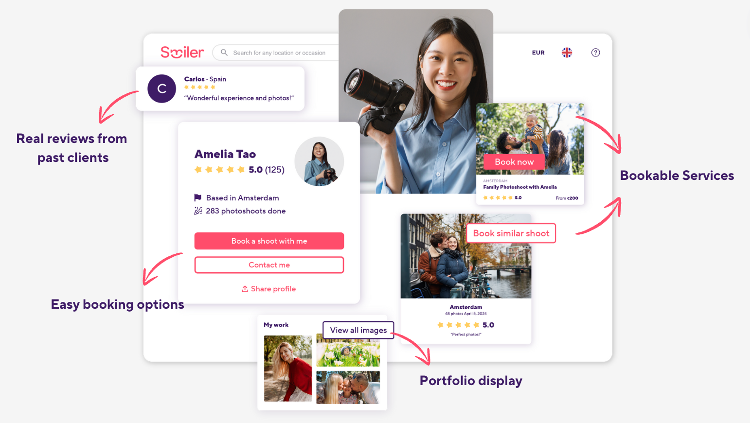
For potential clients who are on the fence, a glowing review could be the deciding factor. That’s why Smiler’s Storefront is a game changer. With every gallery sent, your Suite automatically nudges clients to leave a review. Then, with your clients' consent—which is also collected automatically—those glowing reviews are displayed on your Storefront without you lifting a finger. This way, you can spend more time shooting and creating instead of getting bogged down with admin work. It’s about working smarter, not harder, right?
Add a Call to Action (CTA)
Every page on your website, including your "About Me" page, should serve your marketing strategy. A Call-to-Action turns these pages from passive information sources into active marketing tools that contribute to your business’s objectives.
So, don’t leave visitors hanging after they read your "About Me" page. Without a CTA, a visitor may feel lost about how to proceed, leading to missed opportunities for engagement and conversion. Whether it's a link to your portfolio, a contact form, or a booking page, make it easy for them to take action.
A strategically placed CTA can significantly increase the likelihood of turning a visitor into a lead or customer. It reduces the friction in transitioning from interest to action by providing a clear path to follow.
Sticky CTAs on Amelia's Storefront stay visible as clients scroll, ensuring that at any point in their browsing experience, they can easily book with just a few clicks.
Keep It Updated
As you grow professionally, your skills, services, and experiences evolve. Regularly updating your "About Me" section communicates to potential clients that you are active in your field and dedicated to your craft. Plus, over time, your target audience or the services you offer may shift. By keeping your "About Me" section updated, you can make sure the information you're providing is relevant to the people you are currently aiming to attract and serve.
From a technical standpoint, search engines favour websites with fresh content. Regular updates to your "About Me" page, incorporating relevant keywords naturally, can boost your site’s search engine rankings, making it more visible to potential clients who are searching for photographers or photography services online.
Conclusion
To turn potential clients into actual bookings, your "About Me" page needs to convey something special—something they can't achieve on their own. It's not enough to simply express your passion for photography; your "About Me" section should trigger a desire in potential clients to hire you.
Your goal is to make potential clients see the value you bring beyond just taking beautiful photos. You want them to feel that hiring you will provide them with an experience they can't get anywhere else.
What's next?
If you're reading this, it's likely that you're gearing up to update your website. With the tips we've shared, we're confident you'll nail that introduction. But if you're over the hassle of constant website maintenance, you should give Smiler Photographer Suite a try! Smiler's Storefront feature is like a portfolio website with superpowers. You create and publish it once then your Suite handles the rest. Create your free account now and see it firsthand!

For more photography marketing tips, browse our growing collection of articles on our blog. You'll find useful tools, techniques, and best practices, with many insights straight from the mouths of successful professional photographers!

